How To Overlap Elements In Elementor Website Builder? (3 Easy Steps)
Overlapping elements can make your site look professional and stylish. Also, you can add more information on a screen without making it look boring or stuffy. Elementor is one of the best website builders for WordPress users. It is simple, easy, and comes with a live preview screen. And the best thing is that Elementor allows you to overlap multiple elements on your site. Let’s learn how to overlap elements in Elementor.
How to Overlap Elements in Elementor?
Elementor is a great tool to build WordPress web pages. We’ve talked more about this tool, regarding pros, cons, pricing, and features, in our detailed Elementor Review. If you’re looking to get Elemetor Pro and use the premium features for advanced web page building, we recommend our exclusive Elementor Pro discount codes to get you at least 30% OFF on your purchase.
It is easy to create multiple sections with Elementor’s drag-and-drop interface and tweaking with the Z-index margins. In fact, you can change the opacity to make different elements visible. We’re going to discuss all of it in this article.
In most web designs, each element is surrounded by whitespace. Whitespaces are good for readability and focusing only on the content. This allows users to explore every website element, one at a time while scrolling through the website. Too many elements can increase your website size and make it harder for it to load.
Overlapping text over images or combining two sections is one way to reduce website size thus decreasing the loading time and highlighting important information. There are other ways to reduce the loading time of your websites such as using appropriate web hosting, using a lightweight theme and many more. Feel free to check out our detailed guide on how to speed up your Elementor website to decrease the loading speed and increase your conversion rate.
Nevertheless, with overlapping elements in Elementor, you can make an interactive website. Here’s how to overlap elements in Elementor.
Create Multiple Sections in Elementor
Elementor allows you to overlap multiple images, texts, and sections. But for starters, create two elements and try to overlap them. Using the Elementor page builder, you can create two separate elements using images, background colors, etc.
I recommend creating text documents as images with your favorite photo editor. Overlapping images are easier as you already know their dimensions. It also allows you to create two images with the same pixel ratio.
To create elements with Elementor, go to Pages and click on Edit with Elementor to edit an existing page. Or, you can click on the Add New to create a new page.
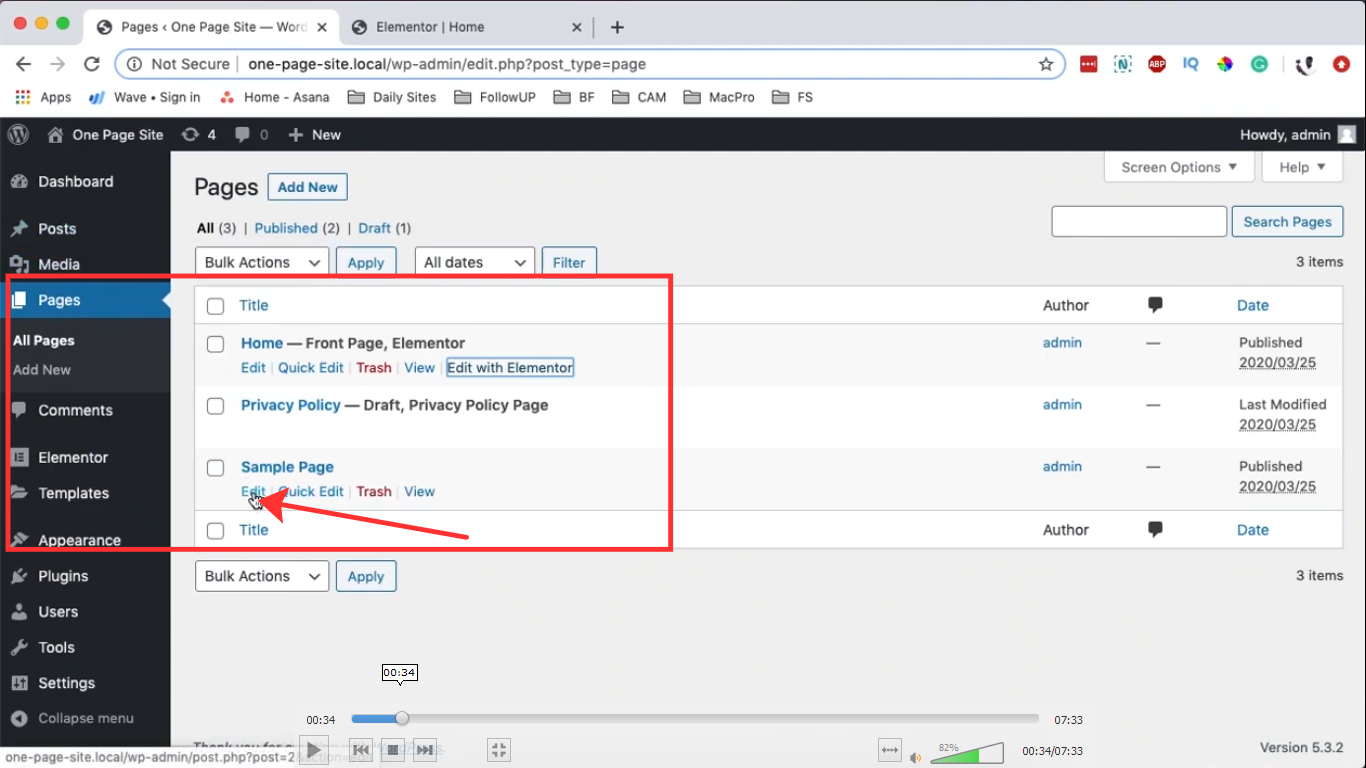
Under the Page Settings, set Page Layout to Elementor Canvas. After that, click on ‘+’ to add a new element.
Now, click on the widget’s icon on the left pane and search for the divider widget; drag it to your section.
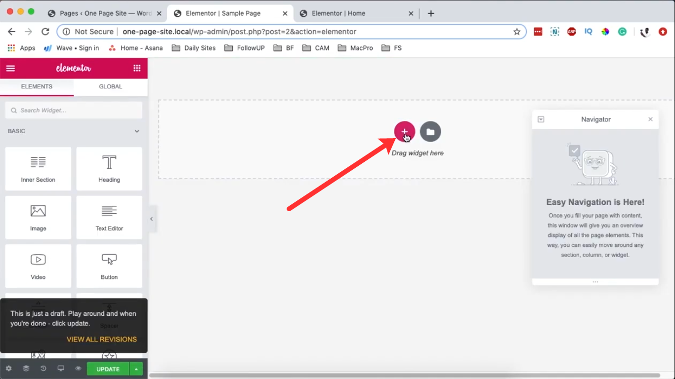
Click on the Edit Section area. Under Layout, set Height to Min Height of 400 pixels. Under the Style section, select a background color. Select the divider and give it a white background under the Style.
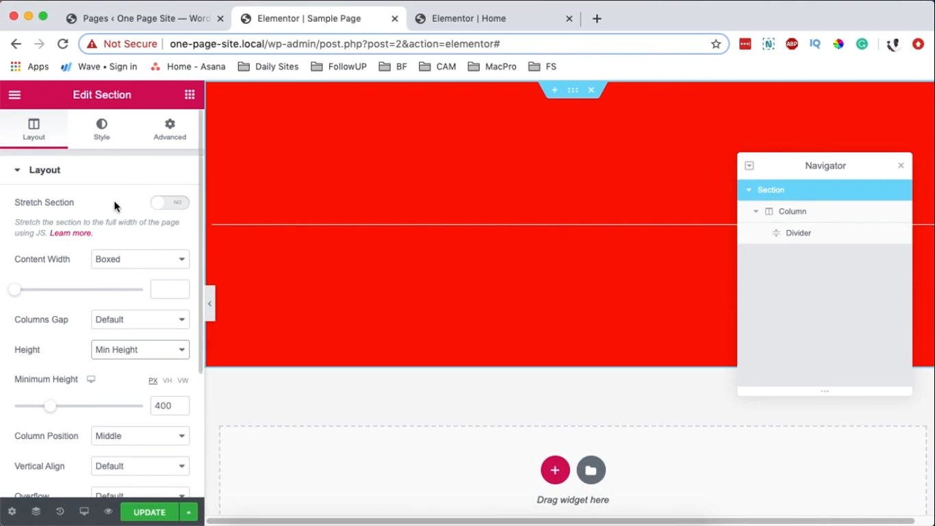
Now, select the section and right-click to duplicate it. Then, under the Style, give another color to the duplicated section.
Overlap Two Elements in Elementor
Since now you have two elements ready, you can overlap them using Elementor.
For this, you have to decide how you want to overlap elements. Elementor allows you to overlap elements in many styles, such as side-by-side, one over the other, diagonal from each other.
Thus, I’ll recommend our readers to take pen and paper to draw a rough layout of your website. This way, you can better decide which overlap will make your website sing out.
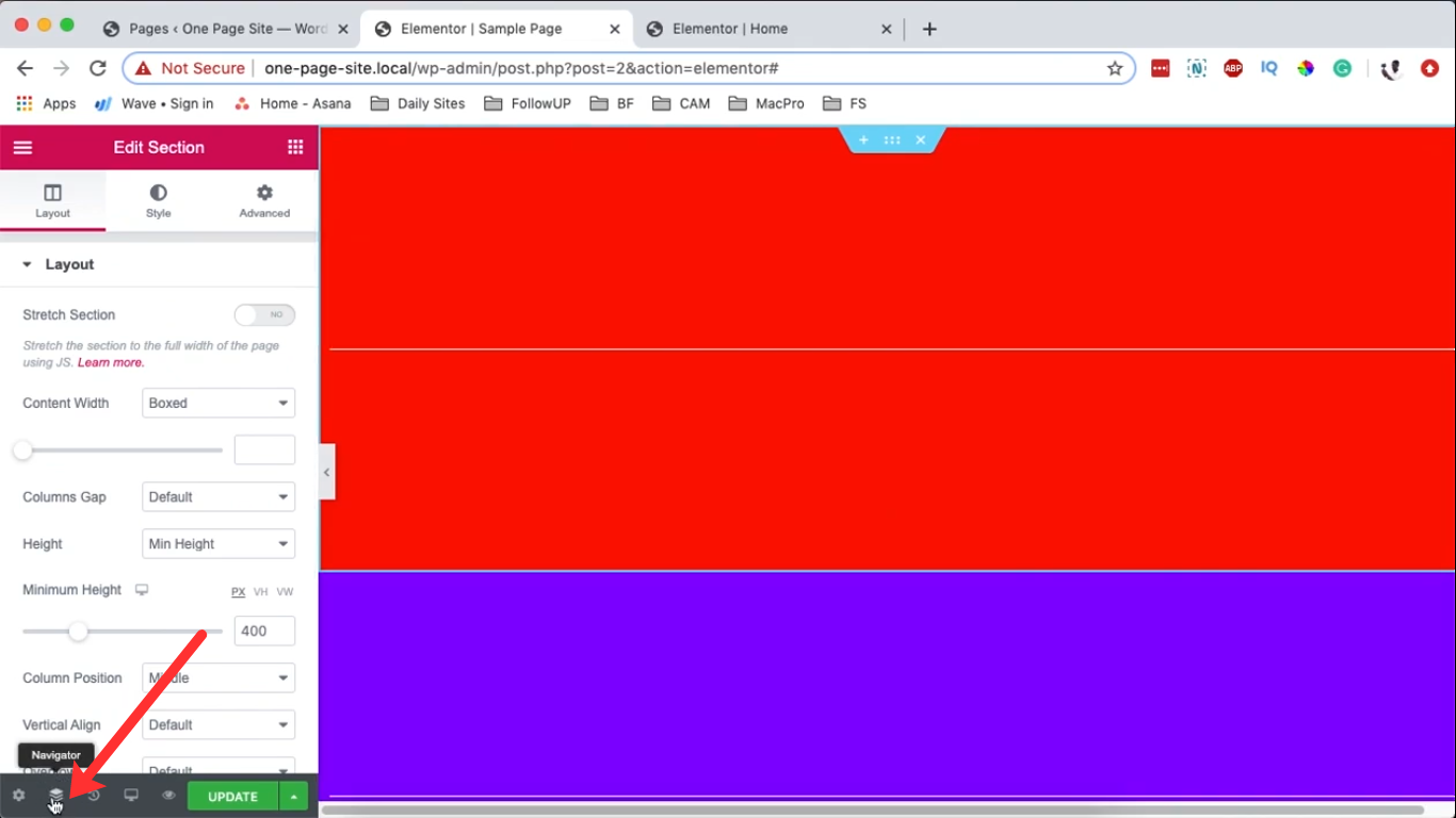
To do so, click on the Elementor Navigator button located at the bottom of your edit screen.
Once you are on the navigation window, you can access all the sections present on your web page.
Select the section you want to overlap and go to the Advanced Edit Section area on the left. Now, add -100 pixels on the Top margin; this moves it into (on top of) the first section.
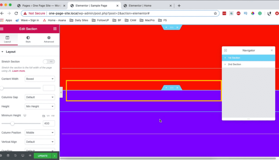
If you want to overlap the top section over the bottom section, select the first section and change its Z-index value to 10. This happens because the first section has higher priority.
Always the section with a greater Z-index will move on top of the other.
Overlap Three Sections in Elementor
If you want to play a little more with Elementor, you can try to overlap the three elements. For example, duplicate a section and give it a new background color under the Style.
You need to give a higher Z-index value to the section you want on the top. For example, give these Z-index values to your three sections:
- 1st Section – 0
- 2nd Section – 1
- 3rd Section – 2
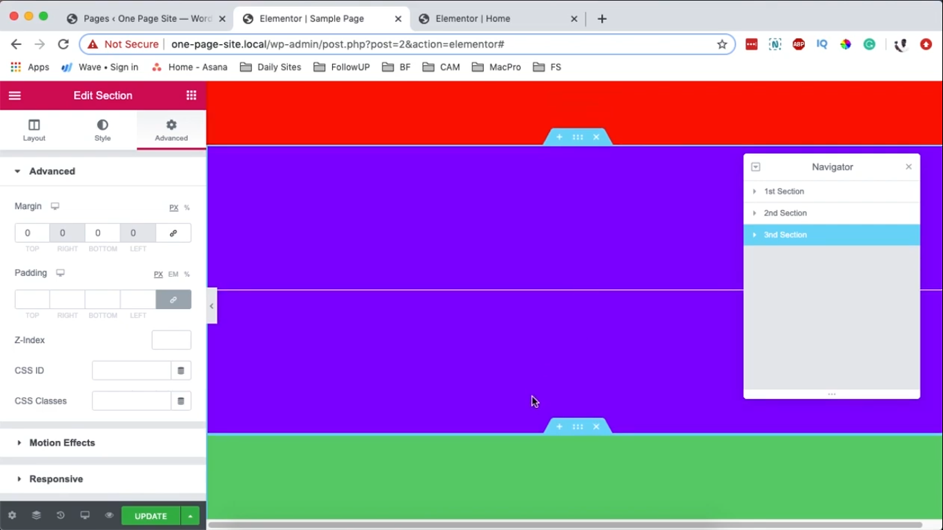
Since Section 3 has a higher Z-index, it will automatically overlap the first and second sections.
How to Change Opacity, Size & Border in Elementor?
You now know how to overlap two or three elements in Elementor. But if you want to create a bit of a complex web layout and make the two overlapped images visible over one another, tweak with opacity.
Opacity means an element’s transparency. For this, select the top element – go to the Style in the Elementor editor. There, you will find an option to change the element’s opacity, size, and border.
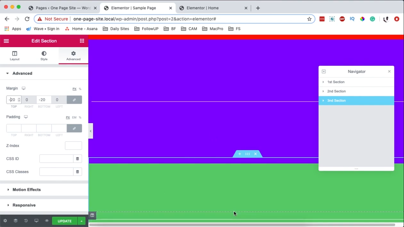
You can make changes in the Elementor editor to adjust the overlay as per your wish. For example, you can reduce the opacity by 5% or 10% and check in the live preview if you are getting the perfect overlay layout or not.
Quick Tips to Overlay Elements in Elementor
Overlay typography over hero images to make your content look appealing. If your website has a grid layout, consider overlapping elements side by side. This will remove lines between content and make your website design look natural rather than boxy.
You can go asymmetric to make your website look dynamic and unique. You should draw your website design before using asymmetric overlapping.
Conclusion
As you have already seen, it is easy to create an overlapped website design with Elementor. You can create different elements and overlap them using the Elementor editor.
On the top, if you know CSS codes, you can click on the Advanced tab, toggle the Custom CSS, and write your code.
I prefer the automatic method rather than coding to overlap elements. That’s because Elementor has made it easy to customize WordPress using drag-and-drop. Elementor Pro offers many advanced features to design your websites, like 90+ widgets, pixel perfection, and more.
Check more details about Elementor here.

Leave a Reply