How to Preview Mobile Version of WordPress Website from Desktop?
With so many users switching mobile browsing from desktop to mobile & tabs, every website owner should know how to make responsive websites. So let’s say that you are in the developmental stage and want to preview mobile version of WordPress website from Desktop. How would you do it?
Fortunately, there are two very simple ways to preview the layout of your website on mobile devices, and no, it will not require you to switch to different devices. Let us show you just how simple and effective previewing the mobile version of your site can be.
Why is it Important to Preview Mobile Version of Your Website?
Being able to preview the mobile version of the WordPress website from a desktop will allow you to make quick changes, as well as witness their effects.
Did you know that a fair majority of the users use their mobiles as opposed to computers to access the internet? In fact, mobile-friendliness has become such an important feature that Google now uses a mobile-first index as one of the ranking algorithms in SEO. That’s why it is very important to ensure your website looks presentable when accessed through a mobile device.
Mobile Friendly Websites Are Certainly The Future
Some things are worth the effort – and making a mobile-friendly website is certainly one of them.
Sometimes, going the extra mile and putting in a bit more effort is the key to ensuring the mobile friendliness of your website. You might need to create different versions of your most impactful landing pages that will be optimized for mobile users’ needs. Hey, it will all be done for a good cause – not to mention the benefits it will have for your website.
If you wisely choose a responsive WordPress theme, it automatically scales appropriately for mobile devices. But we still recommend checking how it looks on various mobile devices. Apart from that, you might want to build multiple versions of key landing pages and optimize them for mobile users, which ultimately helps in increasing the reach. Check out our latest guide on how to install responsive wordpress theme.
Ways To Preview Mobile Version of WordPress Website from Desktop
This article will show you two methods on how to preview the mobile version of wordpress from the desktop.
Please note that mobile previews aren’t 100% accurate and perfect as there are tons of screen sizes and browsers available. The ultimate test is always to check your website on an actual device and see how it looks.
Use WordPress’ Theme Customizer
WordPress automatically provides a way to preview the mobile version of your website using the WordPress Theme customizer feature.
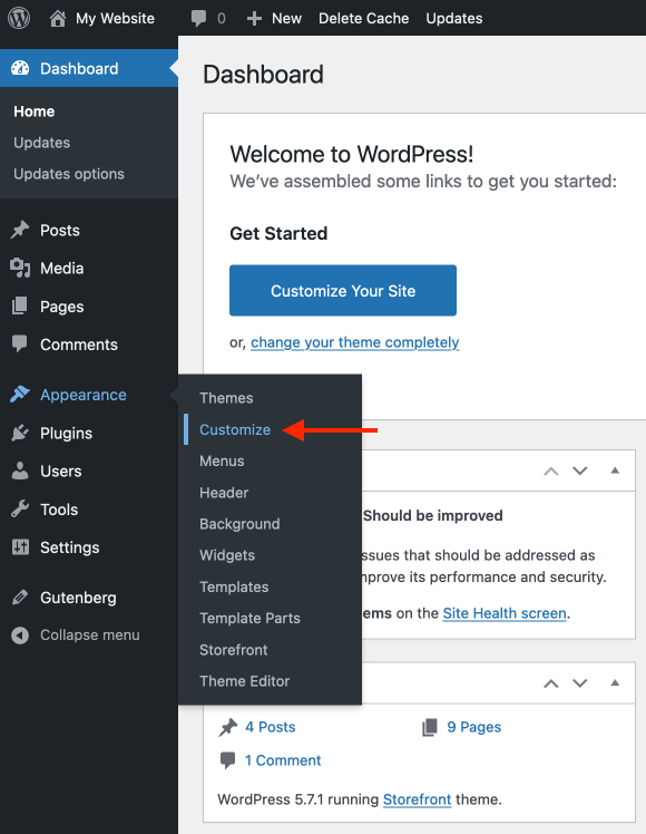
- Log in to your WordPress Dashboard, and head to Appearance > Customize screen
- You will then see a WordPress theme customizer that allows you to change various options related to your theme. The options on the left might vary depending on the theme you’re using.
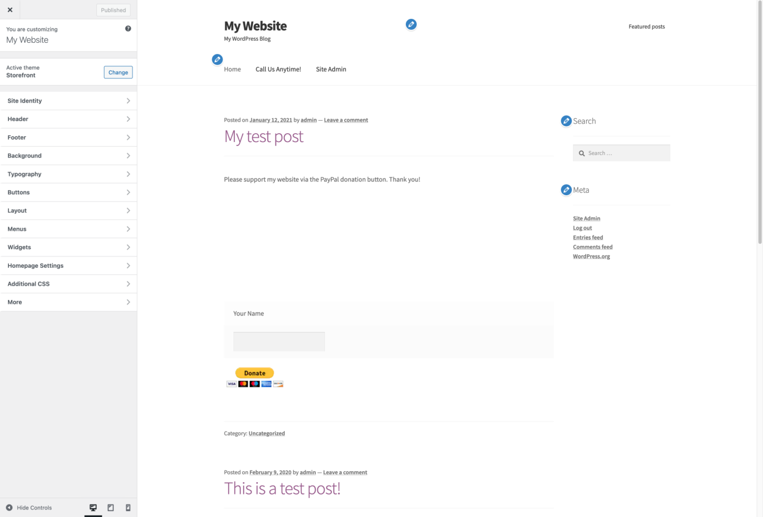
- Please note that the blue pencil icons only show in the theme customizer – they’re not present on your live website.
- To preview mobile version of your wordpress website from desktop, click the phone icon in the bottom-left corner
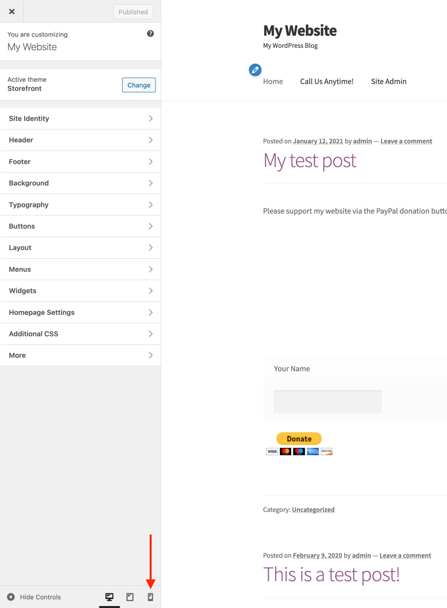
- If you want to see how your website looks on a tablet device, click the icon next to it
- When you click the mobile phone icon, the WordPress theme customizer will automatically give the preview of the mobile version of your WordPress website from desktop
- And here’s how it looks on a tablet device
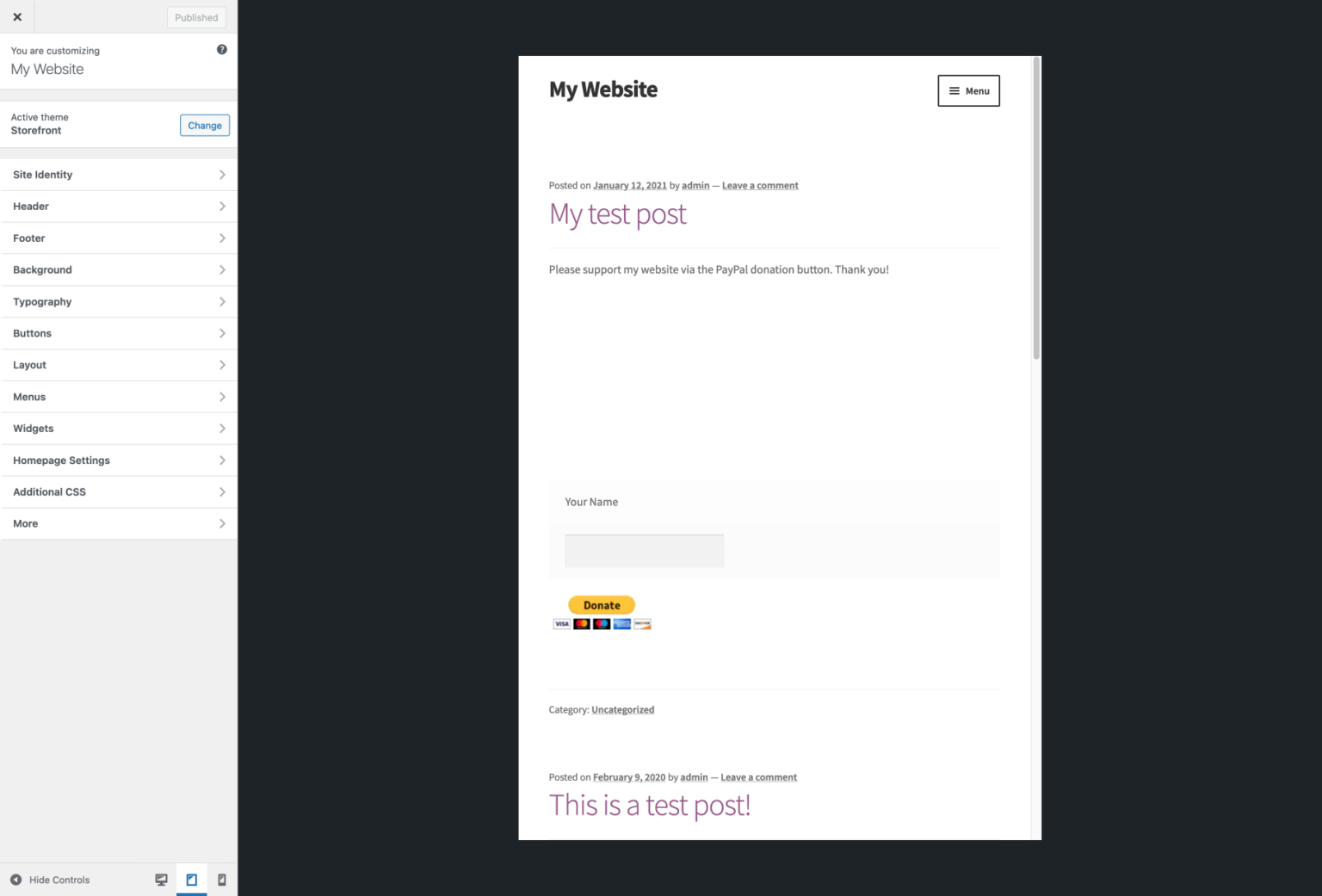
- As you can see, this method is quite helpful to preview mobile version of wordpress from desktop and know if it’s not yet live and under maintenance mode.
Use Google Chrome DevTools
Google Chrome browser comes with a collection of developer tools that allow you to perform various checks on your website, including a preview of a mobile device version.
- Open the Google Chrome browser on your desktop computer, and visit the website you want to check out (it could be your website or even your competitors).
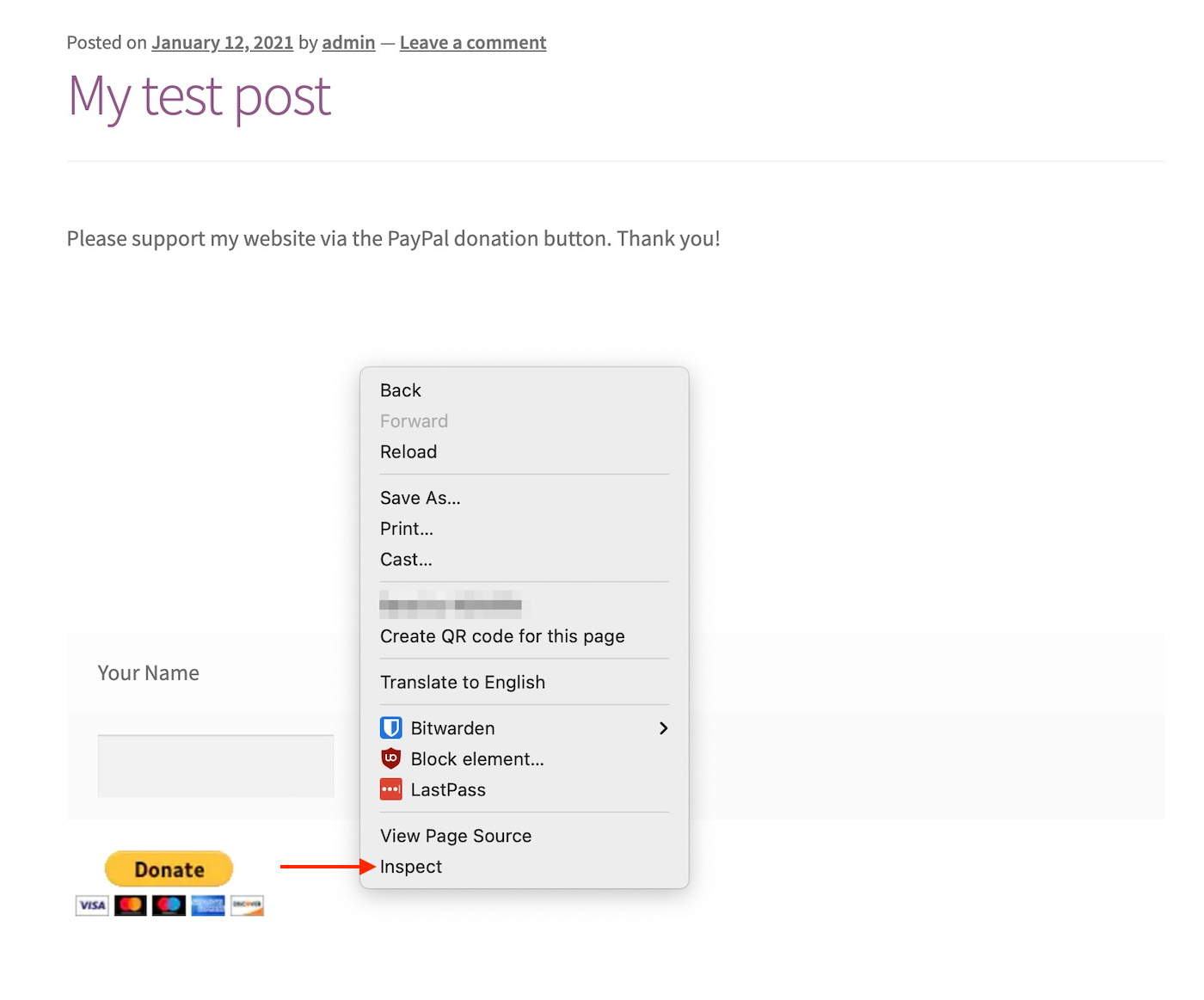
- Next, right-click on the page and click the Inspect option
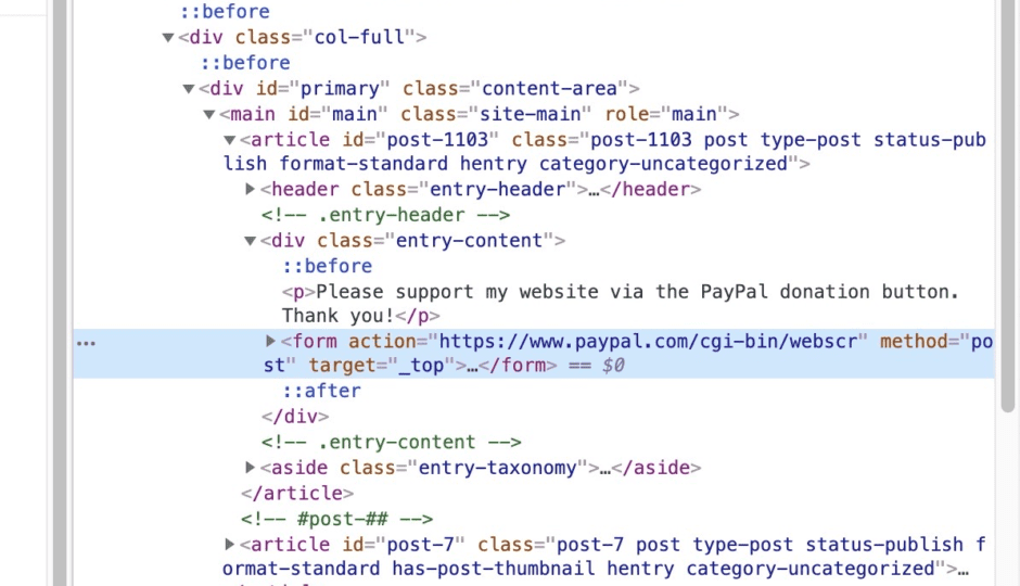
- You will see a new panel open on the right-hand side of your browser that shows your website’s HTML code
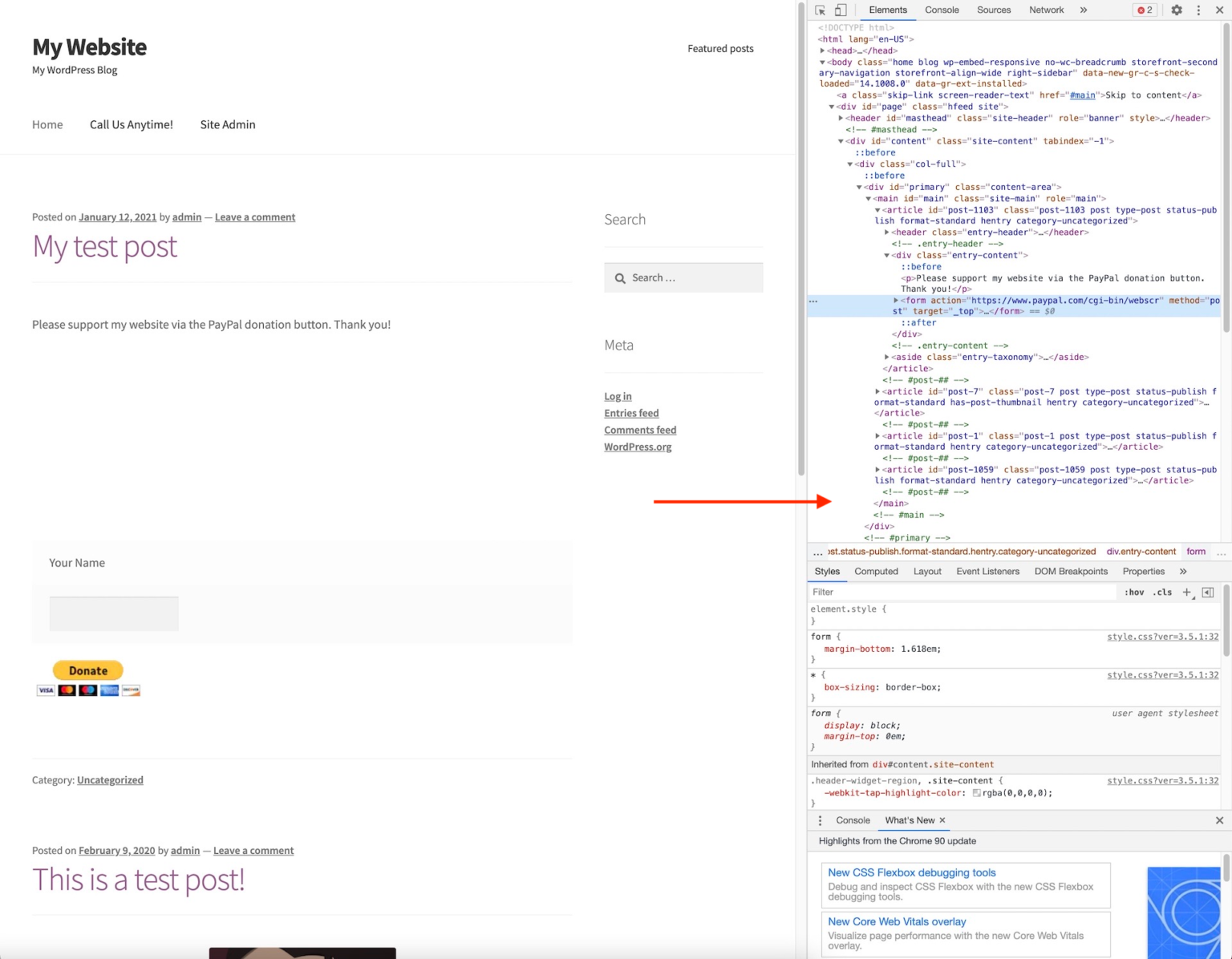
- In the top-left corner of the developer tools pane, click the Toggle Device Toolbar icon to switch to preview mobile version of wordpress from desktop.
- The preview of your website will automatically shrink to the mobile screen size. Additionally, the behavior of your website will adjust according to usage in mobile devices
- If you move your mouse cursor over your website on the left, you’ll see a circle icon instead of the arrow:
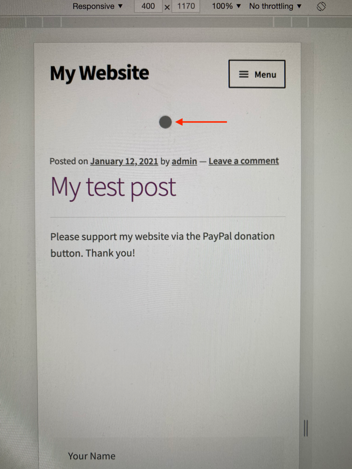
- This circle mimics the touchscreen on the mobile phone. You can use it to test swiping up and down and clicking on various items on your website.
- Suppose you hold down the Shift key on your keyboard. Now when you click and move your mouse, and it will simulate the zoom-in/out pinching.
Lastly, check the options above your mobile website preview. There, you’ll find the controls that allow you to preview the mobile version of your WordPress wesbite from desktop. Additionally, it lets you test your website performance on different mobile internet connections. You can also rotate your mobile screen to test the functionality.

Wrapping Up
Since more than 50% of visitors come from a mobile device – your website must be responsive and easy to navigate. Also, remember, Google is now using a mobile-first index. That simply implies your website has to be mobile-responsive and load fast in order to rank on Google search results. However, only having a responsive website isn’t enough, as mobile users require different things than desktop users.
- For example, if you use lead generation forms on your website – you should set them up differently for mobile users.
- Forms shouldn’t require too many descriptive details that are hard to fill in on a mobile phone keyboard. So ideally – you should only require an email address.
- Additionally, you need to make sure they’re pretty and easy enough to close if the visitor hesitates to fill them.
Also, tons of top best WordPress themes and plugins allow you to add specific functionality and create elements specifically for mobile users. Those plugins behave differently than desktop users. Additionally, you can use dedicated page builder plugins such as Beaver Builder, Divi, Elementor to customize your landing pages.
Lastly, please optimize your website as much as possible to make sure it’s fast on mobile devices. Doing that will improve your audience engagement and will lead to an overall increase in traffic. These are the basic ways to enhance your website’s user experience.

Leave a Reply