How to Customize Flex Theme from Out of the Sandbox?
A study says, 73% of shoppers expect brands to understand their unique needs and expectations. Out of the Sandbox’s Flex theme offers a dynamic and customizable experience to enhance the visual appeal and functionality of Shopify store. In this guide, we’ll explore the several options to customize Flex theme’s elements, which will help Out of the Sandbox users looking to improve their Shopify store’s UI/UX.
Benefits of Customizing Out of the Sandbox Flex Theme
Out of the Sandbox added customization to the Flex Theme so that users can easily make their online stores look unique. This flexibility is important because every business is different, and people have different preferences. Here are some simple reasons why they added customization:
- Make your online store look different from others.
- Work for all kinds of businesses, no matter what they do.
- Help users easily use and enjoy their websites.
- Keep up with the latest design trends.
- Simple for both beginners and experts to use.
- Look good on any device, like phones and computers.
Check out our guide on how to customize Shopify theme with Out of the Sandbox theme editor.
How to Customize Out of the Sandbox Flex Theme?
Out of so many best premium Shopify themes, let’s talk about Flex from Out of the Sandbox. Customizing the Out of the Sandbox Flex Theme is a straightforward process that allows users to personalize their online store’s appearance and functionality.
To begin, access the Theme Editor and navigate to Theme Settings > Elements. Here, users can fine-tune various components such as icons, breadcrumbs, drop-down menus, forms, heading dividers, sidebar, tables, quantity boxes, and tags.
Let’s go through one by one how to edit these elements.
Configuring Icons
- To edit icons in the Out of the Sandbox Flex Theme, follow these simple steps.
- Start by accessing the Theme Editor and navigate to Theme Settings > Elements.
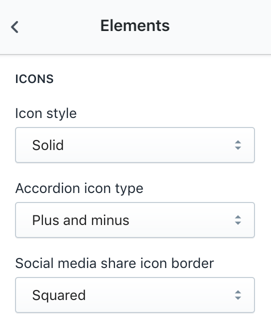
- Within the Elements settings, locate the “Icons” section. Here, you can customize the appearance of icons throughout your theme.
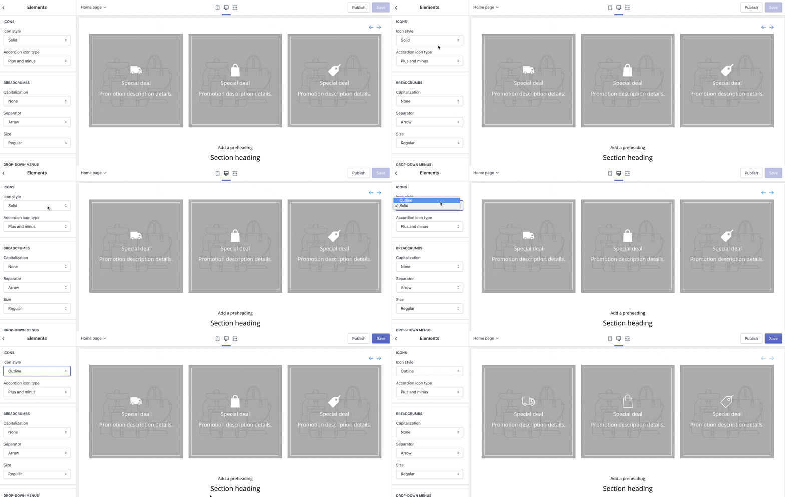
Choose your preferred icon style, either solid or outline. Additionally, customize the accordion icon type for FAQ pages and Sidebar, if toggled on.
- The accordion icon can be set to display as either plus and minus or carets.
- Moreover, adjust the social media share icon border setting to appear either squared or rounded.
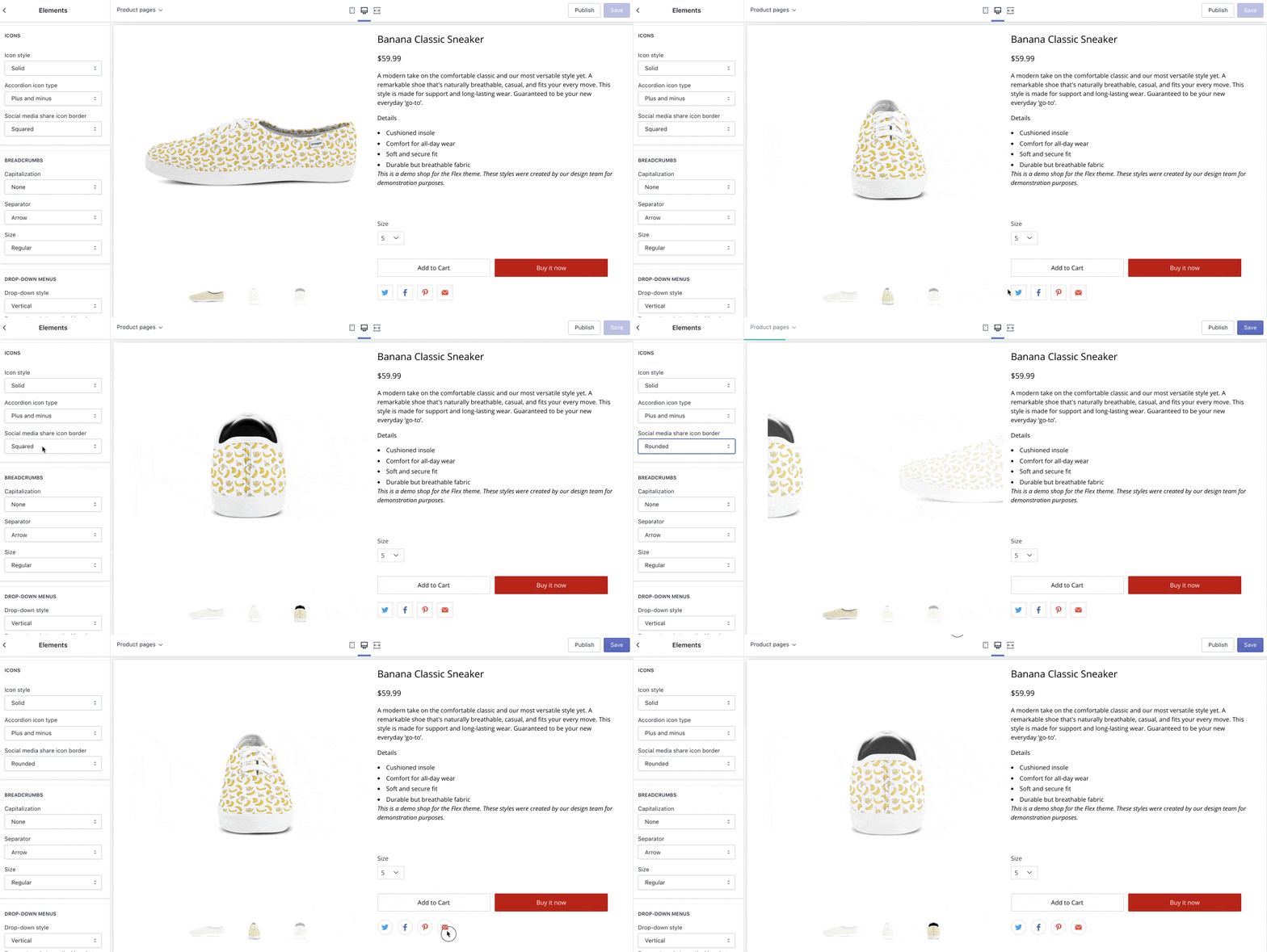
These straightforward customization options allow you to effortlessly tailor the visual elements of your website, ensuring consistency with your brand identity and enhancing the overall aesthetic appeal.
Perfecting Breadcrumbs
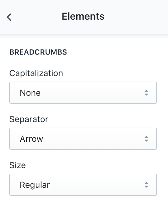
Breadcrumbs are an essential navigation feature, aiding visitors in easily traversing your website. The Breadcrumbs settings allow users to customize capitalization, separators, and size, providing a personalized touch to the navigation experience.
- To customize breadcrumbs in the Out of the Sandbox Flex Theme, go to the Theme Editor and select Theme Settings > Elements.
- Find “Breadcrumbs” in the Elements section.
- Adjust the capitalization (none, lowercase, or uppercase), separator (arrow, bullet, caret, or slash), and size (small, regular, or large).
These simple changes help you create clear and visually pleasing navigation paths on your online store.
Optimizing Drop-down Menus
Drop-down menus play a crucial role in streamlining navigation. The Flex theme empowers users to configure drop-down styles, positions, and vertical spacing, ensuring a user-friendly and aesthetically pleasing navigation experience.
- Start by going to the Theme Editor and choosing Theme Settings > Elements.
- Look for the “Drop-down menus” section.
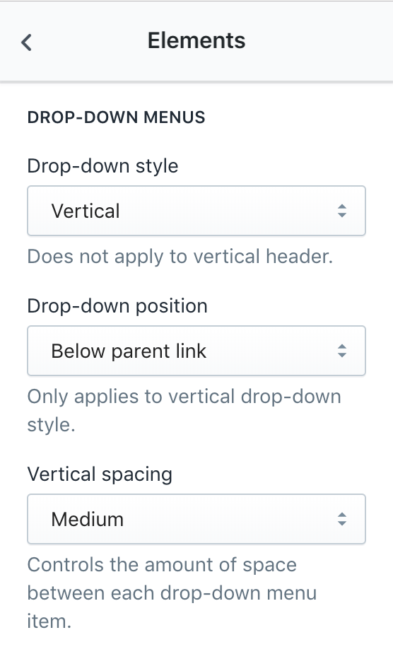
- Customize your dropdown menus by selecting the drop-down style (vertical or horizontal), adjusting the position (below the parent link or below the header for vertical style), and setting the vertical spacing (small, medium, or large).
These customization options empower you to create a user-friendly navigation experience that suits your website’s layout and design preferences effortlessly.
Refining Forms
Forms are vital for user interaction, and Flex Theme’s Form settings offer customization for contact forms, newsletters, and popups. This section guides users on enabling placeholders and selecting button styles, streamlining communication and enhancing user engagement.
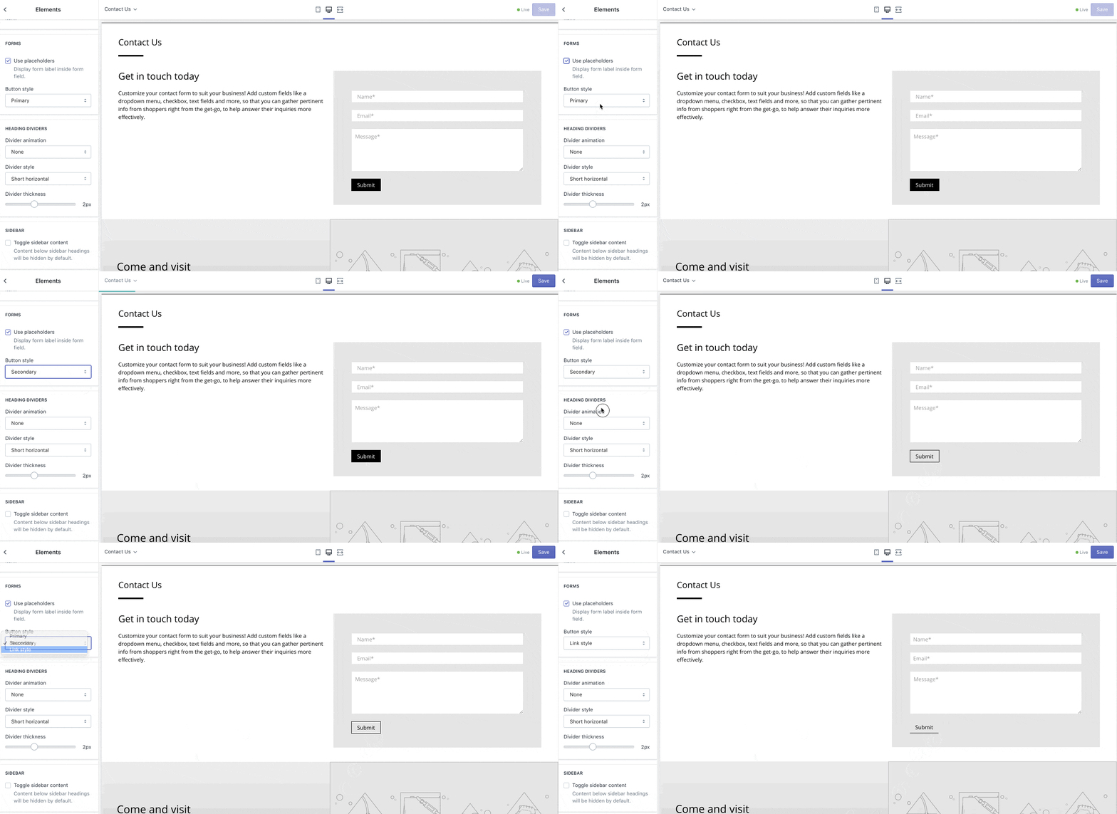
- Begin by accessing the Theme Editor and selecting Theme Settings > Elements.
- In the “Forms” section, you can enhance your website’s communication by enabling placeholders, which display labels inside the form fields. Toggle the ‘use placeholders’ setting to activate this feature.
- Additionally, customize the form’s submit button style by choosing from primary, secondary, or link button styles under the ‘button style’ setting.
These simple adjustments enable you to streamline user interaction and contribute to an improved overall user experience on your online store.
Personalizing Heading Dividers
Heading dividers bring structure to your content. Flex Theme provides options to customize divider colors, animation styles, and thickness, allowing users to create a visually cohesive and engaging website.
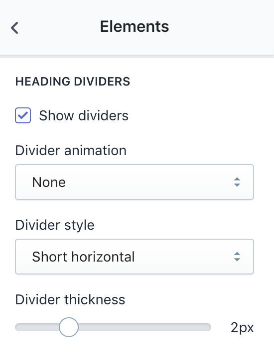
- Navigate to the Theme Editor and select Theme Settings > Elements.
- Find the “Heading Dividers” section to refine the appearance of dividers in various areas like featured collections, blog posts, Instagram feeds, and more.
- Choose the divider color by going into Theme Settings > Colors > Headings Divider. You can control whether to show dividers by checking or unchecking the “show dividers” setting.
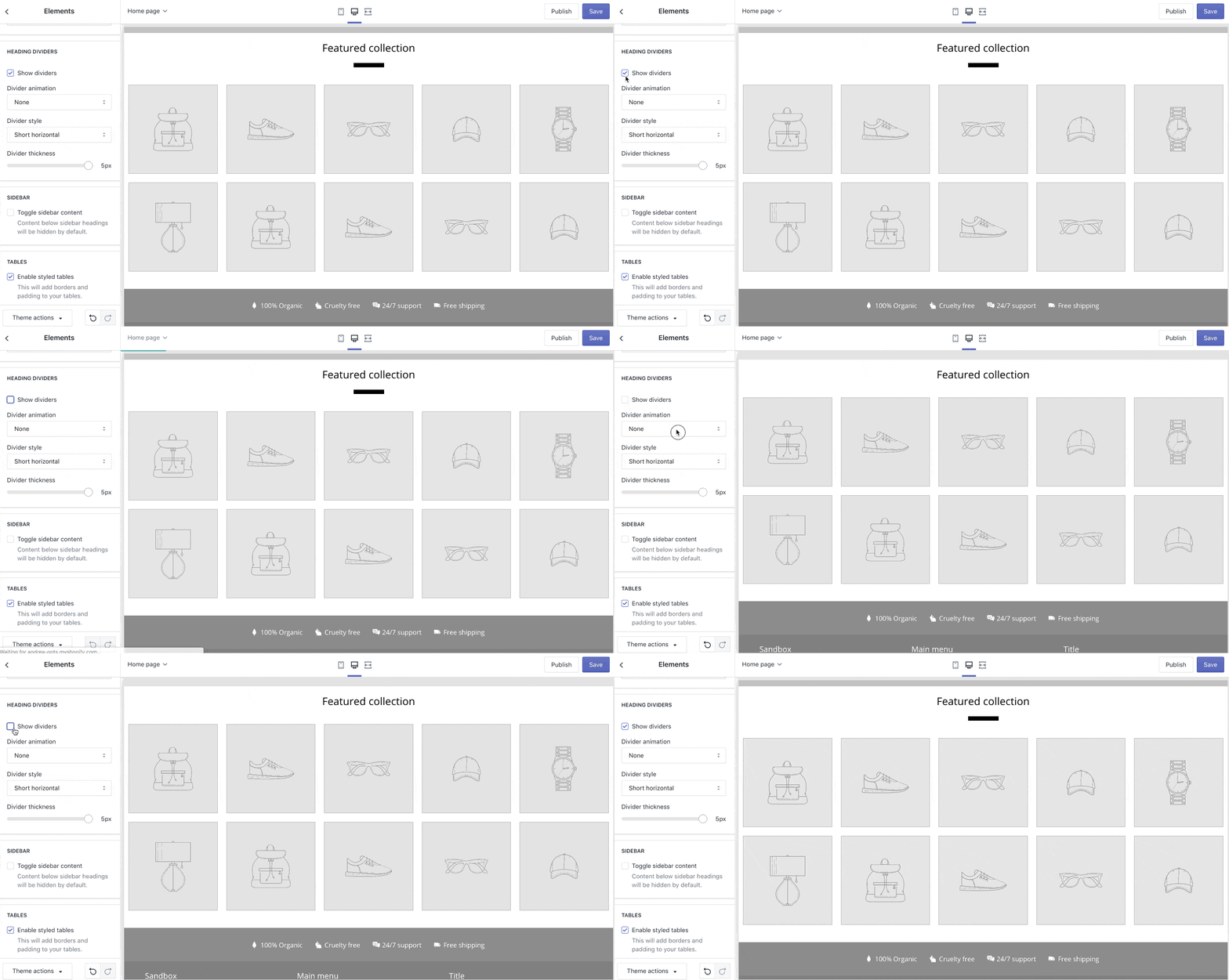
- Adjust the divider animation style with options like none, fade-in, slide-in, etc. Select the desired divider style (short horizontal, long horizontal, or vertical) and set the thickness using the divider thickness slider.
Mastering Sidebar Settings
The sidebar is a versatile tool for presenting content. Flex Theme’s Sidebar settings enable users to toggle sidebar content visibility and enhance the overall layout and functionality of their website.
- Access the Theme Editor and select Theme Settings > Elements.
- Within the “Sidebar” section, customize the toggle sidebar content setting to control the visibility of sidebar content.
- Enabling the toggle sidebar content option hides all sidebar content by default, displaying it only when toggled.
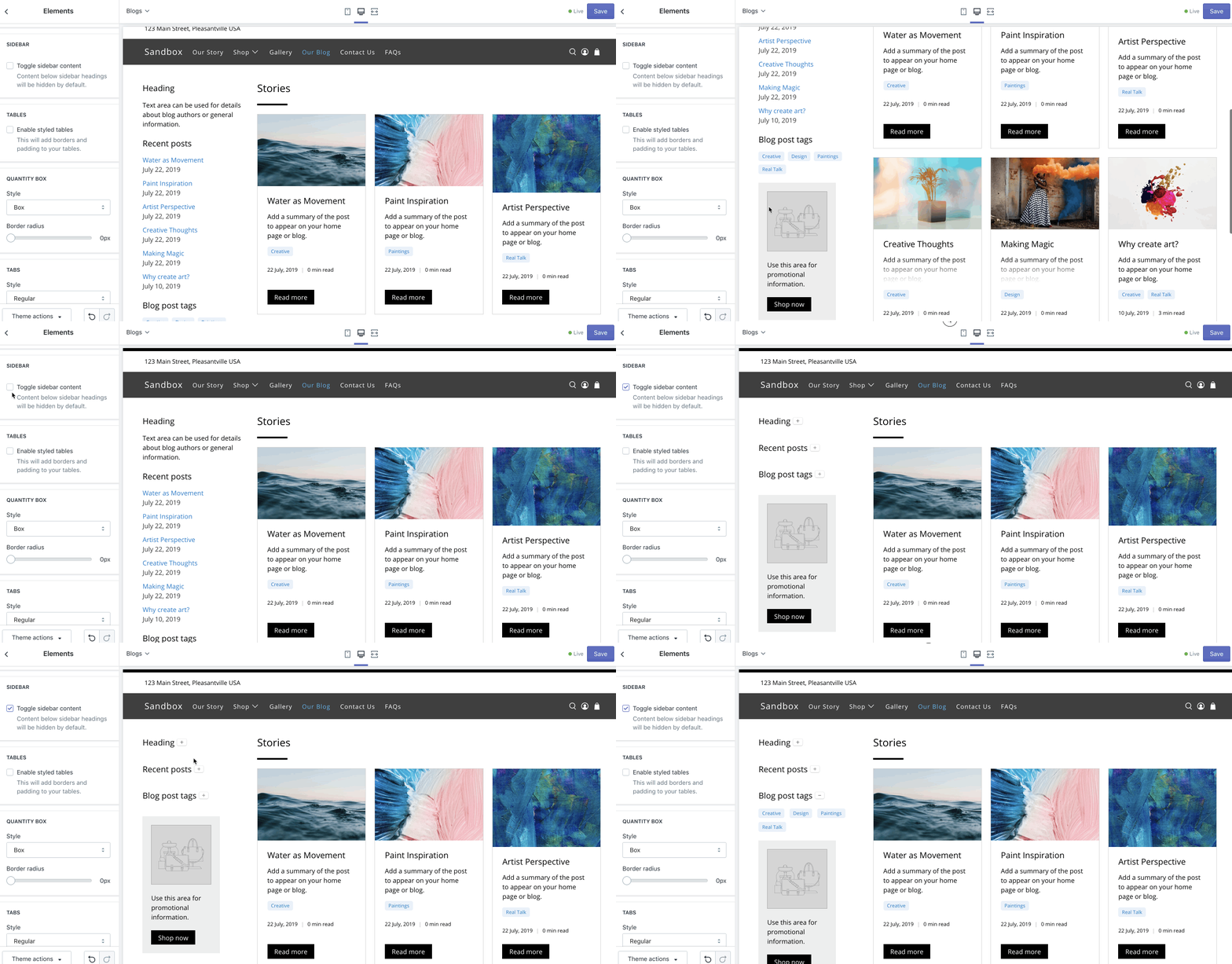
- If this option is disabled, sidebar content remains visible by default.
Now you have the flexibility to create dynamic and user-friendly sidebars across various sections of their online store, enhancing the overall layout and functionality.
Styling Tables Effectively
Tables are essential for presenting information effectively. Flex Theme’s Styled Tables setting provides a sleek look with borders and padding, ensuring a polished and organized display of data.
- Navigate to the Theme Editor and select Theme Settings > Elements.
- Under the “Tables” section, customize the appearance by enabling the styled tables setting.
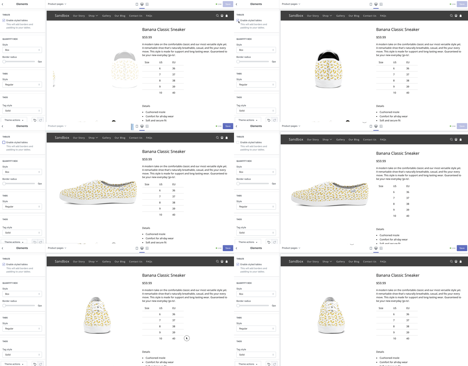
- When enabled, this setting adds borders and padding to tables throughout your theme, providing a polished and organized look.
Perfecting Quantity Boxes
Quantity boxes are crucial for e-commerce functionality. Flex Theme’s Quantity Box settings allow users to customize styles, border radius, and overall appearance, ensuring a seamless shopping experience for customers.
- Access the Theme Editor and go to Theme Settings > Elements.
- Within the “Quantity Box” section, tailor the appearance of quantity boxes across your theme.
- Choose the preferred style – either “box” or “stacked” – under the “Style” setting.
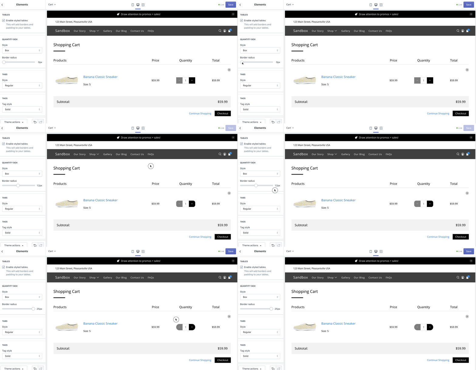
To round the corners of your quantity boxes, adjust the border radius using the slider, ranging from 0 to 25 pixels.
Image
FAQs
What does the “Toggle sidebar content” setting do?
The “Toggle sidebar content” setting, found in Theme Editor > Theme Settings > Elements > Sidebar, allows you to control the visibility of sidebar content. Enabling this option hides sidebar content by default, revealing it only when toggled.
Can I personalize the appearance of quantity boxes in the Flex Theme?
Absolutely! Customize quantity boxes by accessing Theme Editor > Theme Settings > Elements > Quantity Box. Choose between “box” or “stacked” styles and adjust the border-radius slider (0 to 25 pixels) to round the corners for a personalized look.
What options do I have for styling tags in the Flex Theme?
You can style tags by going to Theme Editor > Theme Settings > Elements > Tags Style. Choose between solid or outline styles for tags on product pages and blog posts to align them with your overall design aesthetic.
How do I access the Theme Editor in the Flex Theme?
To access the Theme Editor in the Flex Theme, log in to your Shopify admin panel, go to Online Store > Themes, find the Flex Theme, and click on “Customize.”
Can I revert to the default settings after customizing my Flex Theme?
Yes, you can. In the Theme Editor, navigate to the top bar and click on “Actions.” Choose “Discard” to revert to the default settings. Note that this action will discard all unsaved changes.
Are there pre-designed templates available in the Flex Theme for specific industries?
While the Flex Theme is versatile, it doesn’t offer industry-specific templates. However, its customization features allow you to tailor your website to suit the unique needs and aesthetics of your business.

Leave a Reply