How to Customize Responsive Theme from Out of the Sandbox?
Whether you’re a Shopify pro or a beginner, our step-by-step instructions will empower you to create a stunning store that reflects your brand’s identity. With features like sleek product pages, intuitive mega menus, and mobile-friendly layouts, Responsive, one of the premium Shopify themes, offers a seamless shopping experience for your customers. In this guide, I’ll explore how to customize Responsive theme from Out of the Sandbox.
How to Customize Product Pages in The Responsive Theme?
The Responsive default product template is your canvas to showcase your products effectively to potential customers. It allows you to control various features, layout, and settings to create an engaging product details page (PDP). In fact, we have a guide on how to add sections to pages on the Out of the Sandbox theme. Do check it out. Let’s delve into customizing your product page step by step.
Accessing the Default Product Template
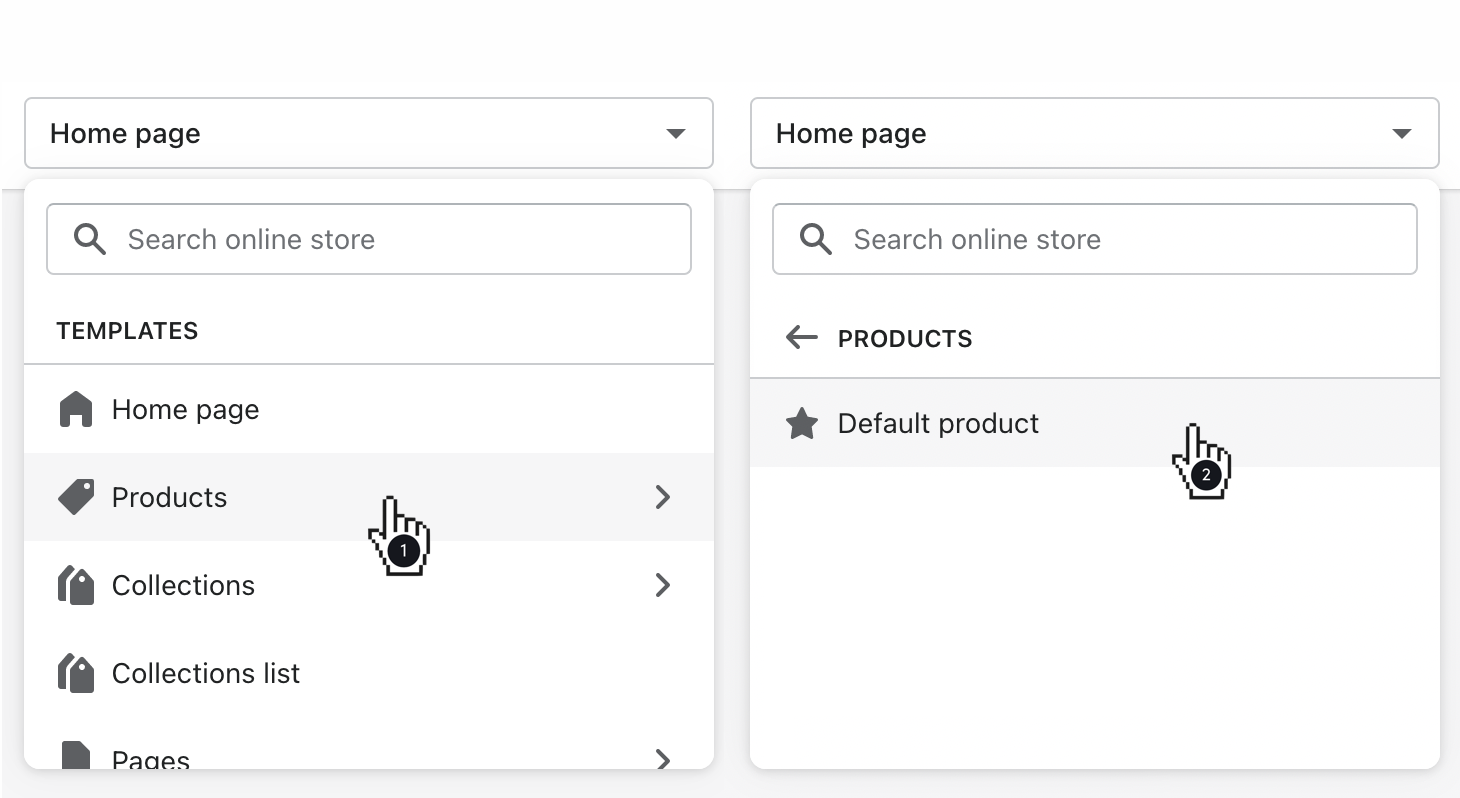
Begin by accessing the default product template. Simply open the page selector and choose Products, then Default Product.
Customizing General Settings
Once you’re in the default product template, you can tweak general settings to tailor the page to your liking. Here’s a detailed guide on how to do it:
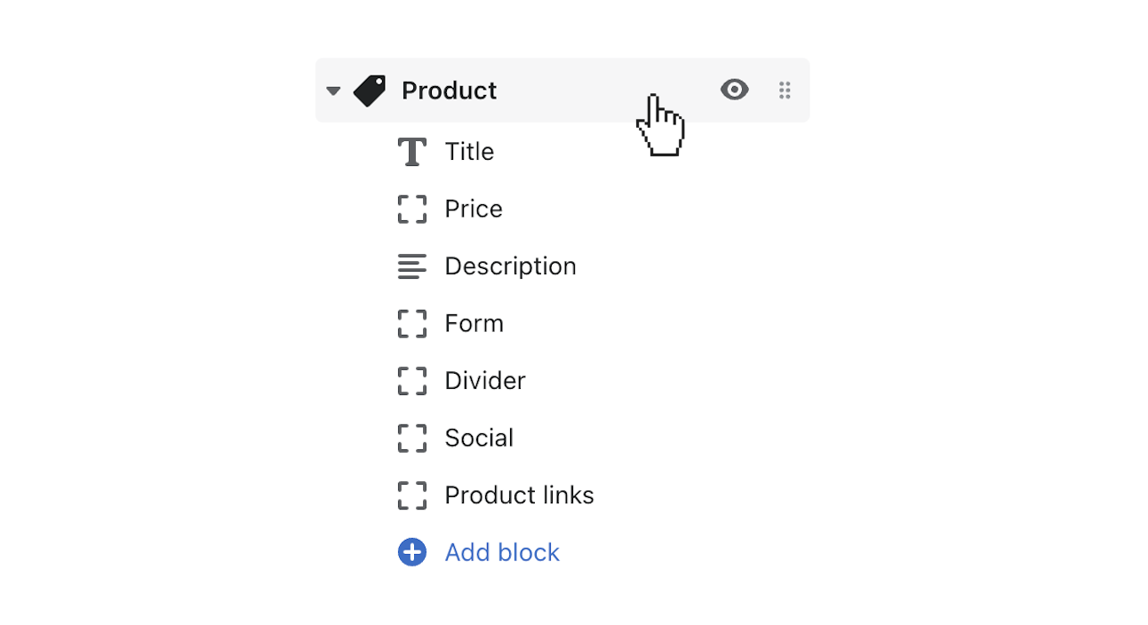
- Show Breadcrumb Links: Enable breadcrumb links to provide users with a trail of previous page links, guiding them through their navigation journey. Simply locate the “Show breadcrumb links” option and toggle it on.
- Show Thumbnails: Display all product media in quick view as thumbnails to facilitate easy browsing. Find the “Show thumbnails” setting and enable it to activate this feature.
- Show Arrows: Enable ‘previous’ and ‘next’ arrows for product media to aid users in navigating through images. Locate the “Show arrows” setting and toggle it on to activate this feature.
- Magnify Product Images on Hover: Allow customers to zoom in on product images for a closer look at product details. Simply enable the “Magnify product images on hover” feature to activate this functionality.
- Gallery Transition & Speed: Choose between slide or fade transitions for your product gallery. Adjust the gallery speed slider to control the display duration for each slide. To disable autoplay, move the slider to the left to set it at 0.
- Thumbnails Position: Control the position of additional media thumbnails by selecting left, right, or bottom options from the “Thumbnails” dropdown. Choose the position that best suits your design and layout preferences.
- Thumbnail Slider: If you have several thumbnail images, gather them into a slider for a more streamlined browsing experience. Activate the “Enable thumbnail slider” option to implement this feature.
- Media Position: Choose between left or right positioning for product media, depending on your design preferences and layout.
- Set Product Media Height: Cap the height of product media by enabling the “Set height of product media” option and adjusting the maximum height slider to your desired value.
Keep your product pages updated and ensure a faster store response time for users. Check out our guide on how to improve load time performance of your Out of the Sandbox Theme.
How to Customize FAQ section in The Responsive Theme?
Your FAQ (frequently asked questions) page is an important part of your online store, providing answers to common questions and helping customers. With the Responsive theme, you can make your FAQ page even better with a dynamic, accordion-style layout. Let’s see how you can personalize your FAQ page to engage your customers more effectively.
Setting Up Your FAQ Page
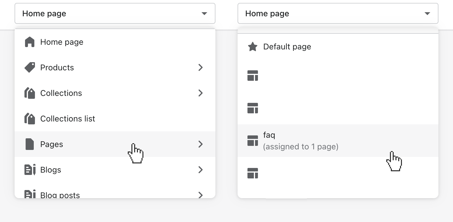
- Create New Page: Start by making a new page in your Shopify admin and giving it a title. Choose the “faq” option from the Theme templates dropdown menu, and then save it.
- Optional Content Addition: Although you manage the questions and answers outside of the Pages admin, you can also include extra content above the FAQ section if you want. Just go to the theme editor to do this.
Customizing Your Template in the Theme Editor
- Accessing Theme Editor: Go to the theme editor (Customize) and find Pages, then select the “FAQ” template.
Tailoring Your FAQ Section
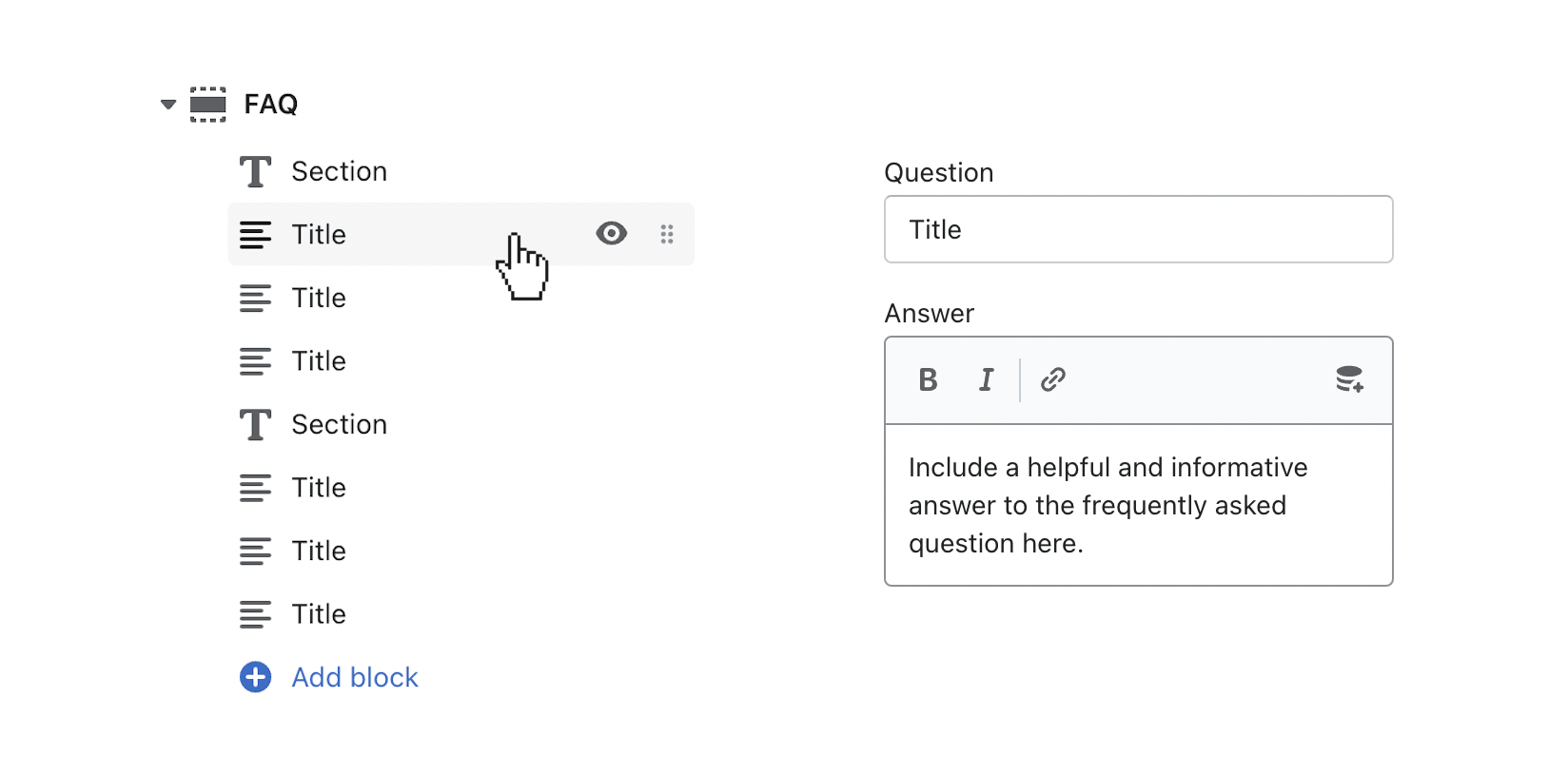
- Exploring Preloaded FAQ Blocks: Look at the preloaded Frequently Asked Question blocks in the theme editor.
- Adding Questions and Answers: Fill in the fields with your customer questions and merchant answers. If you need to add more questions, just click the (+) Add block button.
Adding Visual Elements for Engagement
- Incorporating a Banner Image: Make your FAQ page look better by choosing an optional banner image. It’s best if the image is 1600 x 600 px or 3200 x 1200 px.
- Enhancing with a Dark Banner Overlay (Optional): To make your page look even nicer, you can turn on the Dark Banner image option to add an overlay between the image and the page title.
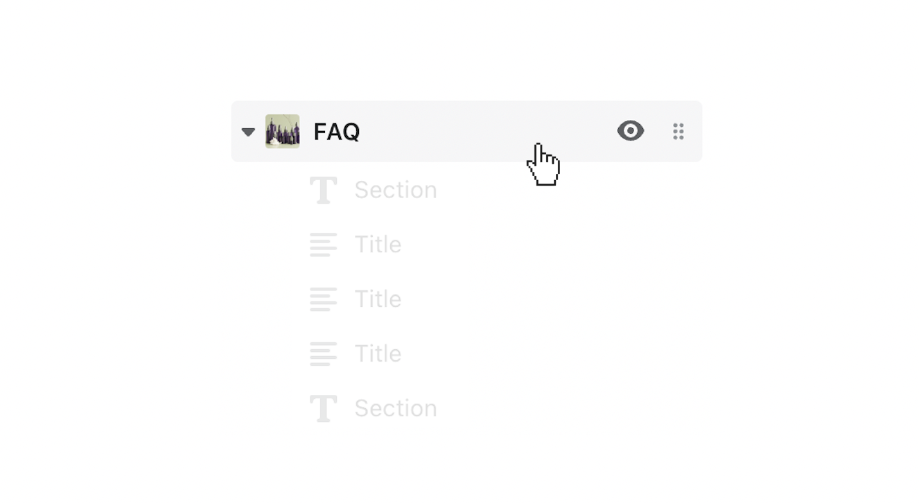
Building FAQs with Images
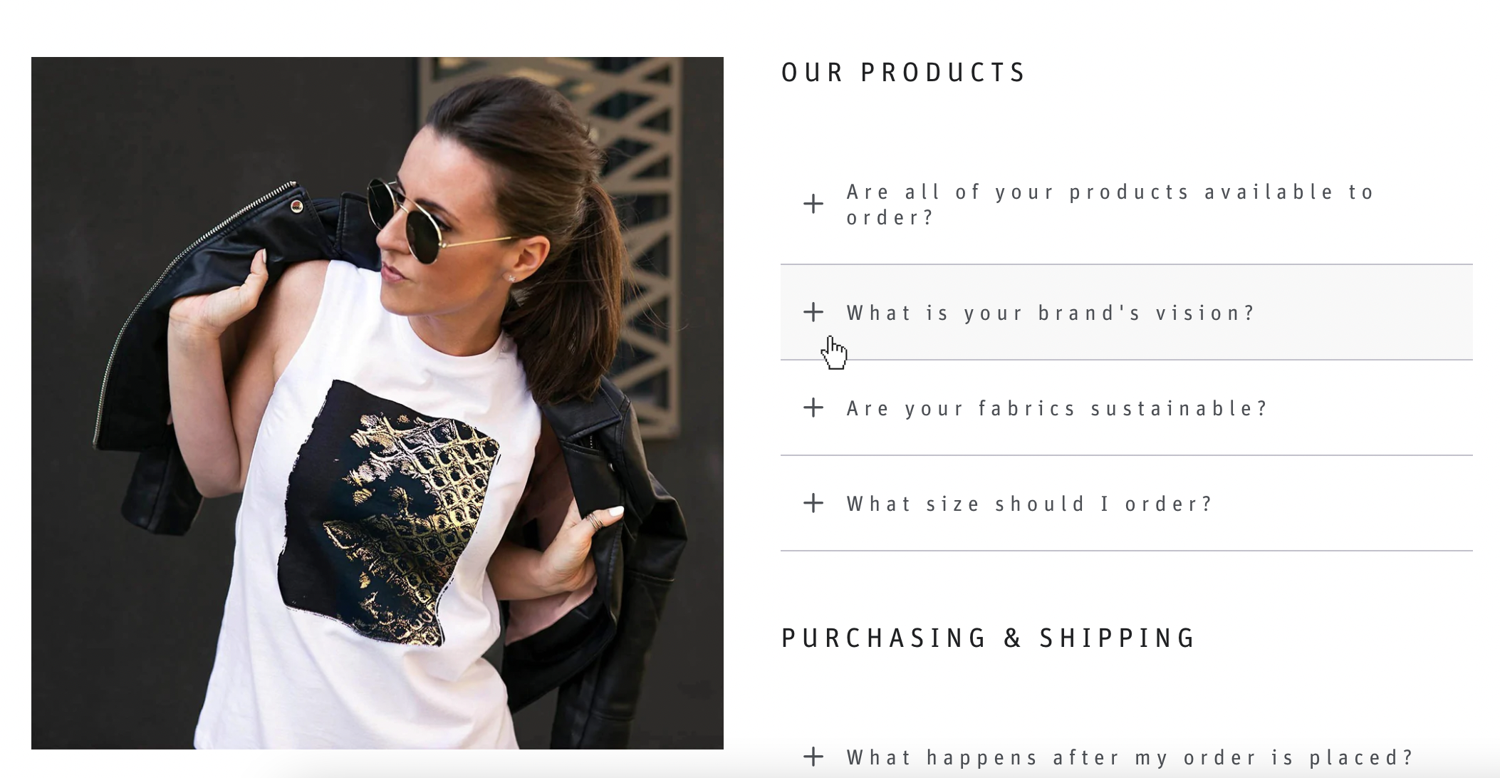
- Integrating Visuals: Add a square image (1000 x 1000px) below FAQ IMAGE to make your FAQ section more interesting.
- Positioning Your Images: Choose whether you want the image to be on the Left or Right side of the frequently asked questions, depending on how you want it to look.
How to Customize Mega Menu on The Responsive Theme?
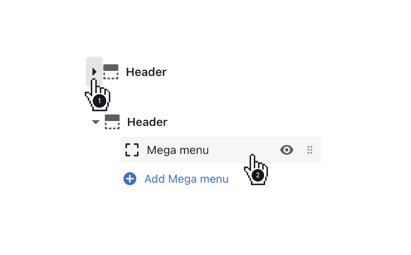
Out of the Sandbox Responsive mega menu is a fantastic tool for showcasing categories and collections, making it easier for your customers to navigate through your products swiftly. Mega menus are particularly handy if you want to organize items by vendor or brand. Let’s explore how you can create and customize a mega menu with Content Column and Bottom Banner features.
- To create a mega menu, you first need to craft a menu in your Navigation admin. The number of columns in your mega menu will depend on the number of menu items you want to include.
- Open the Mega menu section and enter the Link title for the parent link you want the Mega menu to be associated with. For instance, if you want your mega menu to appear under the “Our Shop” menu item, type ‘Our Shop’ in the Link title field.
- Select the navigation menu you want to use by clicking on “Select menu” below the Mega menu.
- Add a Heading using the provided field.
- Click “Select Image” to add an 800 x 800px image.
- Add text and link it to a URL using the provided fields. Choose a Position for the feature (First column or Last column).
- Add text and link it to a URL.
- Customize the Background and Text colors to match your theme.
Mobile Layout: On mobile devices, the Mega Menu transforms into a drop-down menu, with each column turning into its own drop-down menu. Your Content Column and Bottom Banner will still be visible if you’ve enabled them.

Leave a Reply